This project has been on my mind for a long time, and it's been a long process learning what I wanted and how to execute it. However, I'm happy with the result and I can't wait until I get the itch to do something new again. Things always get better with time! I'm like cheese. And wine.
THE OLD
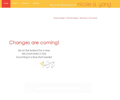
The home page: Over the past year, visitors to the site have been greeted with welcome text, my smiling face, a flash of rollover navigation, and finally, the announcement that changes are coming!
The about page: This page has been prisoner to template format and has always lacked design. In an attempt to show visitors who I really am, a pane of images filled the length of the left side.
The portfolio page: Poor usability and navigation and pointless click throughs characterized my portfolio -- a sad fate, especially since that's the point of the site!
The resume page: This is probably the only page that works relatively well! It does what it needs to do and provides my experience in simple text, while also providing a PDF download.
The contact page: Pretty bland, I'd say.

For my new site, I knew I wanted something pretty simple and modular and very easy to navigate. I didn't want it to be overladen with widgets, updates, graphics and click-throughs. While I knew exactly what I wanted the layout to be, the color palette and rebranding (sort of) was extremely difficult. I'm a color palette nerd, so I spent hours mixing and matching colors. Colors needed tweaking (a little more magenta or a little more yellow), tossing out, or tossing in. I finally came to a decision!
THE NEW
Colorful, but not as harsh as the red and yellow from my previous site, this palette consists of some of my favorite tones -- ones that I hope make you feel relaxed but fun-loving.
After that was decided, it was time to put everything together! I coded the site myself, using Dreamweaver and some good advice from a friend. In addition, there's a bit of CSS work in there -- one style sheet for the site and one for the scroll element. The design elements were created with Photoshop and Illustrator and then finally put together and made live!
The home page: A welcome screen with my bright smiling face :) No really, this is my site and you should immediate know who's behind the work and the writing. Additionally, this is first opportunity you get to see what my brand is and how it matches your taste. On the left is permanent navigation. No matter which tab you click on, the navigation stays the same. And there will always be five links to click. My site should be simple to use.
The about page: More about me! I'm being upfront here. Some of the things I tell you may seem like meaningless details about my lifestyle, but I really think it's those tiny things that make you feel like you actually know a person. Plus, I'm sure we have things in common.
The portfolio page: There's easier navigation here -- all you have to do is scroll to the right! Sections are preceded by a tab like "editorial" or "multimedia" and a description of the piece is below.
The resume page: Again, it's a simple scroll to the right. Arranging the type in multiple columns makes you feel like you're only reading a bit at a time. We all know what it's like to open a page full of text: no fun. This breaks it down for you. Extra bonus? At the bottom of the content area, there's a download link in case you want my resume in PDF form.
The contact page: Simple and sweet. Want to talk? All of my social media links are there. Want to talk design? Email me and let's chat!
There are still minor tweaks and changes I'd like to make, but I'm really proud of myself for finishing this and I'm happy with how it turned out!
What do you think of it?
Want to go explore? www.nicoleayang.com


Loving the new page!
ReplyDeleteYour new site looks great! I've been wanting to redesign my portfolio too, and seeing yours is beautiful inspiration.
ReplyDeleteThank you, both! Stephanie -- that's so sweet! Good luck as you redesign yours. I had so much fun in the process.
ReplyDelete